The Kickstand Pub Branding + Identity

The source of inspiration for the Kickstand Pub identity and environment. Absolutely AWESOME!
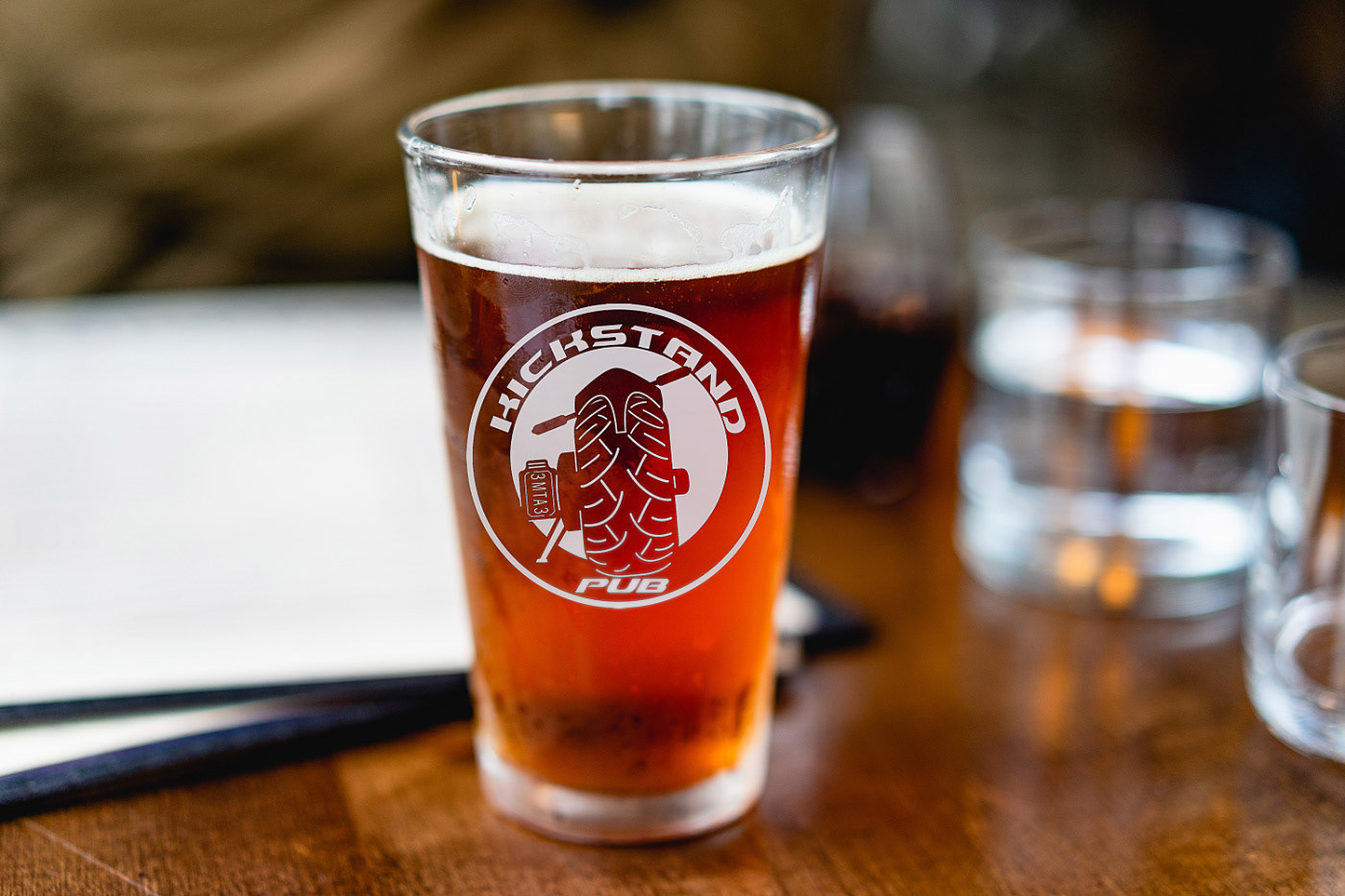
Everything we designed was driven by the motto that, “If it’s not bad-ass, we don’t want it!”, a mindset that significantly clarified branding and design goals. That vision provided everyone involved something to aspire to, and effectively create the richest of designs. Our approach was to design a 2-phase identity system, where the round moniker is the primary brand design and used like a stamp, while the slanted logotype was to be used for signage, band posters, and the more formal representation for the establishment.
The project began with creating numerous sketches. After we settled on 1) a style that echoed the vision and 2) met the requirements of having individual letterforms for the sign, I created the final design.
Dimensions: 4′ x 4′ x .25″ stainless, laser cut, buffed, with additional stainless mounts for neon and hanging.


I had the idea of also creating another sign for the interior of the bar, but this one was going to be really different but still designed to be part of a family.
I wanted to have it carved out of 1/4" stainless steel and back-lit with neon. After receiving the go-ahead, we went through a lot of design sketches and iterations. After settling on the design, I had to convert it into an AutoCAD file so that it could be cut out on a CNC machine.
Both of the logo designs were later placed on all types of collateral, including t-shirts, napkins, beer coasters, matches, and a very large stage background.